One of the ones that got away
Plus a video history of illustration and an overlooked sci-fi rom-com


There are about a thousand reasons that I’m not cut out to be a gigging illustrator, not least of which is the fact that I like to have money to pay my rent and feed my family 🙁But somewhere on that list is the fact that paying clients have the power prevent a project you’ve worked really hard on from ever seeing the light of day.
That happened to me exactly four years ago, and the client was actually my full-time employer. I think enough time has passed that I can share the unseen illustrations without ruffling too many feathers.
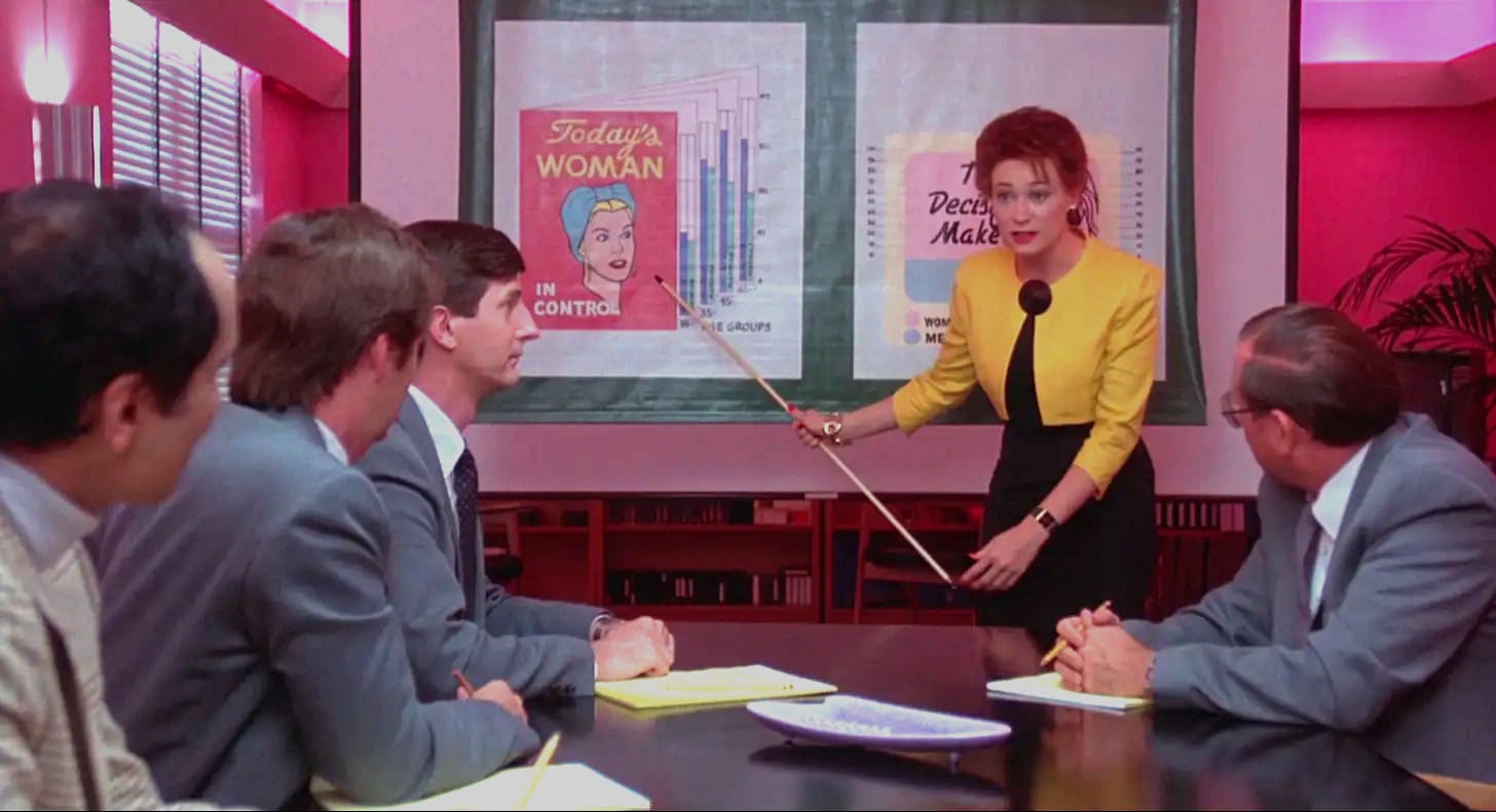
The company was undergoing a major rebranding, its first in about eight years. I wasn’t deeply involved with this project until late in the game, when the creative director suggested that it might be interesting to have me interpret some of the new brand language via illustration. I spent a couple weeks of late nights and weekends working with him to develop the images below.
It was a really fun and satisfying process - he kicked it off by telling me to imagine I was creating a hand-drawn opening-credits sequence à la Saul Bass or Pablo Ferro, only instead of a movie it was for the new company brand. From a series of initial sketches (which were informed by my ideas of using our branded textures in the style of Pixar’s “Day & Night”), we passed each image back and forth a few times, with his notes really helping me hone all the little details to make it pop.
Needless to say, the people who needed to sign off on it didn’t like it. Despite the fact that it reflected the creative director’s own vision of the brand he created, they still thought it was too “weird.” It was quietly relegated to an internal-only document that never got completed. A few weeks later, everything shut down for a global pandemic, and no one has looked at or thought of these images ever since. The company had another major rebranding last year, long after I left, so this is nothing more than a curio. But it’s a curio I worked hard on and had a lot of fun with, so hopefully you get a kick out of seeing the most polished, professional illustration work I’ll ever be in a position to do…


Speaking of great (or “great”) illustration work, I want to share one of my favorite YouTube channels with you. For the past seven years, British artist Pete Beard has been posting exquisite short biographies of great illustrators from the 19th and 20th centuries.
These videos are delightfully spare - the only visuals that appear on screen are the work of the artists in question, carefully scanned to accompany Beard’s enlightening narrations.
Watching these is among my happiest of happy places. I love learning more about illustrators I don’t know well, as well as experiencing Beard’s commentary and curatorial selection of those I do. I love the passion that quivers through his dry voice, and even little details like the fact that you can hear him clicking his mic off at the end of each recording.
One of the greatest treats is his “Unsung Heroes of Illustration” series, which offers capsule profiles of lesser-known figures in the field. He’s up to number 100 in that series - with about four artists covered per video, that amounts to 400 illustrators, all on top of his more in-depth features! (He seems to make an effort to include women artists in this series, but I think the channel as a whole would benefit from more diversity - it’s a lot of white western males, though that was how the mainstream worked during the last couple of centuries.)
And sometimes he’ll take a deeper dive into a collection of illustrations by multiple artists that cohere around a particular subject matter, like the fairy tales of Hans Christian Andersen, Don Quixote, or Mad Magazine.
So yeah, maybe I quibble with his music choices sometimes (though apparently his own band scored the one above!), but otherwise, I find these sheer perfection. Anyone who enjoys illustration and design from the past 150 years or so will likely agree. The only problem is that every time I watch one, I jot down a long list of books that I want to track down. (Books, he says! More books!)
Last weekend I got to enjoy a Q&A at Metrograph with the great director Susan Seidelman. She’s probably best known for helming Madonna’s film debut Desperately Seeking Susan, which I haven’t seen this side of Y2K. But much more recently I’ve enjoyed her two films that flanked that one.
 - IMDb")
Seidelman’s debut, Smithereens (1982), is kind of a punk-rock House of Mirth, with the grungy LES arts scene of the early ‘80s standing in for Edith Wharton’s uptown elite. Wren (Susan Berman) is an insufferable young bohemian who, like Wharton’s Lily Bart, somehow keeps making the worst of a bad situation until all of her avenues are closed. It’s a bleak tale of cold-water flats and late-night assignations, but Seidelman scatters just enough glitter on the grunge to keep Wren’s descent from being a dreary downer. (It also features a seductively sleazy performance by Mr. Blank Generation himself, Richard Hell, in case you felt like questioning the film’s bona fides.)
Smithereens is great, and it led the way to a more expansive canvas - and a more pronounced screwball sensibility - in Desperately Seeking Susan. But the film that followed is my favorite, and that’s the one Seidelman screened at Metrograph last week.
 - IMDb")
Making Mr. Right came out in 1987, and my 11-year-old self was simultaneously intrigued and perplexed by its TV ads. Was this a science fiction film or a comedy or a romance? This combination of elements was altogether too adult for me. Hope and I ended up watching it on a whim last fall, and it was weirder and more wonderful than I could have hoped for. I don’t normally view a film twice within a few months, but the opportunity to hear Seidelman talk about it was too good to pass up - and the movie was just as enjoyable the second time around.
Set in a candy-colored Miami, it stars downtown darling Ann Magnuson as a perky PR rep hired to promote the invention of a lifelike android destined for space travel. Magnuson is a great comedy heroine, but the revelation in this one is John Malkovich, who plays the double role of Ulysses the android and his misanthropic creator (ahem) Jeff. As Ulysses, he leans into the physical comedy in a way that, on rewatching, made me think of Emma Stone in Poor Things experiencing the world with the mind of a child in the body of an adult. But his performance as the petulant, put-upon Jeff is equally as guffawable - together, they’re the funniest performances of his career (and yes, I’ve seen Being John Malkovich). The cast also features hysterical turns from the late Glenne Headley and a wonderfully unhinged Laurie Metcalf.

One of the true pleasures of the film is its production design, which expertly connects the dots between Memphis Group retro chic, South Florida deco, and Reagan-era techno-utopianism. Magnuson’s character drives a bright-red Corvair convertible and wears high heels that sport Keith Haring drawings (which Seidelman confirmed were the real deal). Early drafts of the screenplay were apparently set in Manhattan, where Seidelman’s other films took place, but she pushed to have the story moved to Florida so she could play with a brighter and more colorful aesthetic. (Another detail from the Q&A: the other actors she auditioned for the Malkovich roles were Rutger Hauer - who’d already been an android at that point - and Crispin Glover, who she conceded would probably have been TOO weird.)
The film did not do well at the box office, and Seidelman was never able to work with that kind of budget again. It’s a shame, because there’s really no other movie quite like it. Another case of society punishing a woman who refuses to fit into a neat little box.