


Some of you have made the mistake of telling me that you enjoy it when I delineate the process behind a creative project. To underscore your folly, I’m doing it again.
After the previous flyer I drew for Climate Families NYC, the activist organization I’ve begun working with, they asked if I’d be up for discussing the visual campaign elements of their upcoming Earth Month of Service. The event comprises several weeks of activities for both families (art playdates, a youth climate strike) and grown-ups (call relays, a happy hour).
I met to brainstorm with a couple of other group members, and we decided to explore some ideas around somehow personifying the events. We talked about having fun with some sort of pollution or climate monsters before considering that, as fun as that would be, it might be better to portray positive role models for action rather than negative consequences. One idea was to create some superhero figures aligning with the actions being proposed, with badges/stickers the kids could earn by participating in multiple events. I was invited to make some initial sketches based on these ideas.
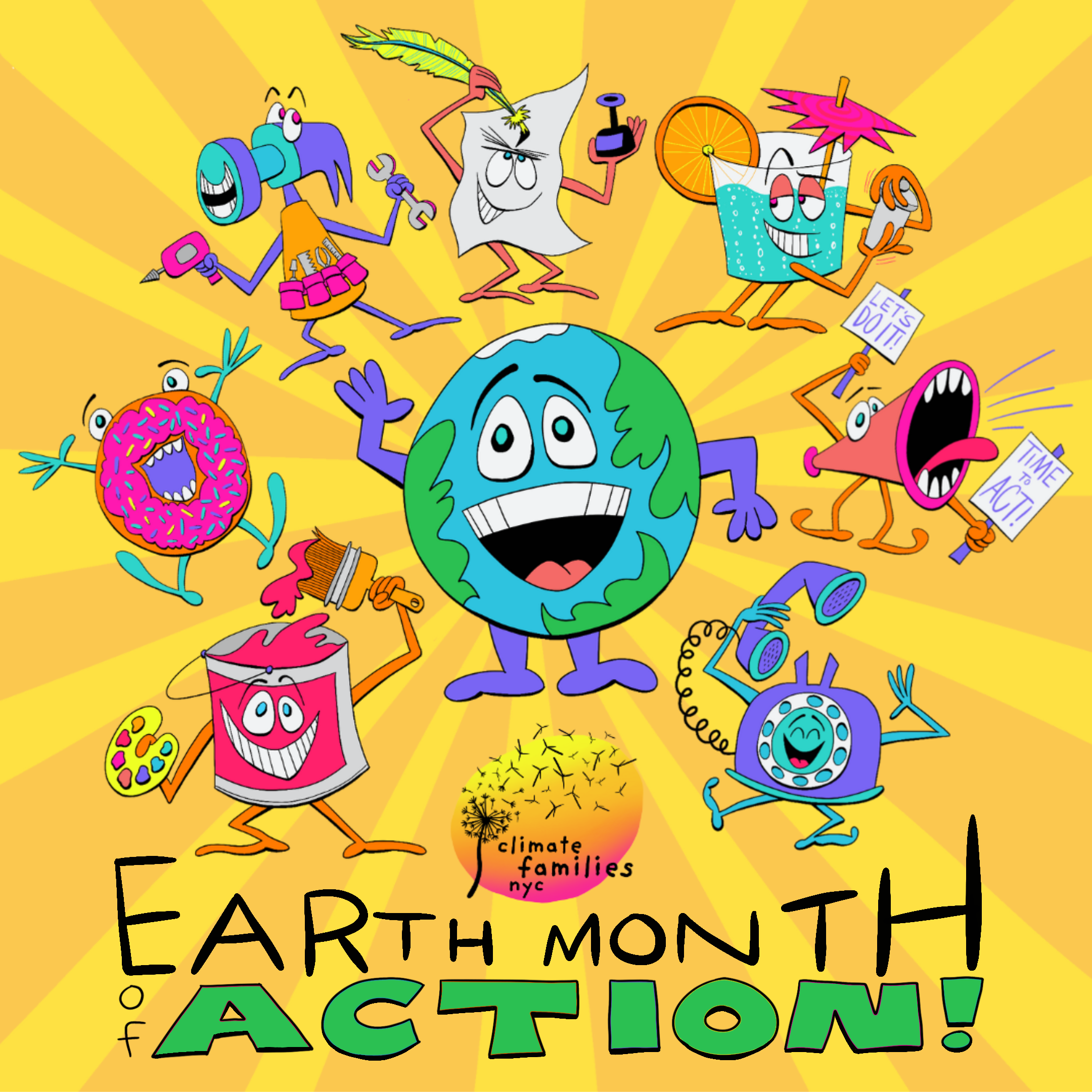
While drawing, I started to feel that superhero imagery is a bit played out and wondered if it would be possible to take a more direct approach to connecting the characters with the events. I landed on a series of anthropomorphized figures that could serve as kid-friendly mascots - a hammer for a climate action toolkit, a piece of paper with a quill for the letter-writing campaign.


After quickly working out the basic parameters of each of the characters, I went back and made more detailed sketches that gave the characters more presence and clarity.


Fortunately, the team was really pleased with the result, so I went on to start creating color versions. As usual with quick-turn projects, I did all of this work with an Apple Pencil on an iPad Pro, using the Procreate app. I was able to trace over the initial sketches as if I were using a virtual lightboard, coloring in the spaces with elements from our brand palette. At first, I wanted to create the characters entirely through color, with no outlines, but as you can see, the results didn’t pop - there aren’t too many darks in the brand’s color palette, so everything felt a bit washed out.


So with that, I decided to add outlines and then color those in instead. But when I was finished with them, it still felt like something was missing. They seemed somehow thinner and blander than the sketches. So I created a new layer and started adding in some different line thicknesses to give the characters a little more weight. That seemed to do the trick! It’s a subtle difference, but see if you can spot it in the samples below.


From there, it went from an illustration task to a design task as I worked out how to best position the images for Instagram alongside the logistical information for the events. The team uses Canva so multiple people can quickly update details as they evolve. I understand the value of this app, but I find it challenging to work with, so I arranged the images as much as possible in Procreate and Photoshop before uploading anything to Canva.
Though I originally wanted to position the characters as if they were standing in a small crowd, I quickly realized that this undercut a lot of the expression I’d added to their poses and turned things into a bit of a jumble. Instead, I decided to array them in a loose circle around the central earth figure, along with a Climate Families logo. I hand-lettered the words “Earth Month of Action” to fit within the remaining space and created a background element of yellow rays to help tie the composition together. From there, I put together a template for two additional slides that detailed all of the events before sending the package off for review.
Here’s where we hit a snag. The team decided that the overall image should include elements that depict the experience of the families who would be participating in the events. These elements would then be carried through across individual event tiles that would be posted in the weeks following the initial calendar.
This presented a challenge, as it required not just tweaking the existing imagery, but adding a completely different dimension into the mix. After the big push I made to get to this point, I’ll admit I struggled a bit with this request. Nothing I sketched out seemed to be working, and I had to put the project aside for a few days while focusing on other things. This gave me the space I needed to propose a few concepts.


I was honest about the fact that I thought the first idea here, with a bunch of tiny little people interspersed among the mascots, was my favorite option. It didn’t disrupt the initial composition, and it complemented the existing characters rather than competing with them. Luckily, the team agreed, and so I spent a few more hours creating a handful of scenes to pepper among the images I’d already created. Here’s how everything came together in the end:


So now here’s my plea - if you’d like to learn more about this event, please get involved! You can sign up for any of these events at a single link. Many of them, like the call relay and letter-writing, can be done from the comfort of your home. And here’s the secret: You don’t need to be a parent to participate! Families are the focus of this group, but anybody can get involved. And if you do, please let me know!