


Jeffrey’s Gallimaufry 01.12.24
Mid-century Modern mood

I’ve had a very Mid-century Los Angeles kind of week - in my mind, at least. A friend came over on Sunday to discuss a project, and we spent a few hours poring over various design books in my possession, with a special focus on books that touched up on the work of Sister Corita Kent, Ray and Charles Eames, and Gere Kavanaugh. Holding onto this sunny West Coast vibe helped to light up a murky, torrential Brooklyn funk.

Sister Corita Kent was a Catholic nun who taught art at LA's Immaculate Heart College, creating work that incorporated advertising and design trends of the 1960s. She was often aligned with Pop Art, but I feel that her work transcends the cynicism and shallowness that often characterizes that movement.

In its childish sense of wonder, entrenched sense of community, activist stance, and firm belief that art should be as much a part of our daily lives as food and shelter, Corita’s work feels more akin to the kitchen-counter art of the Bread and Puppet collective - though it lacks that group’s complete rejection of commercial influences. Corita’s belief is that beauty and inspiration are wherever you find them, and that includes the profane influence of advertising, which she clearly adored.

Corita is best known for her screen printing, but her status as an educator and community leader was the guiding force behind her work. This becomes very clear in Ordinary Things Will Be Signs for Us, a book of her photographs released last year (which is where all these images came from). It helped me keep my spirits up on an under-the-inclement-weather Tuesday afternoon.

The colorful photos depict Corita’s work, and that of hundreds of other collaborators, in the context it was intended for - parades, communion, celebration. They reminded me of what Hope and I were aiming for in our 2015-18 Paper House project on Governors Island - just people, coming together to joyfully create. The Church has always had problems (and it’s telling that Corita was essentially driven from the sisterhood in 1968), but these images present an idealized vision of a brief moment in time when venerable Christian ideas could seem hip, as the mainstream and the counterculture briefly walked hand in hand through the grass.

As a bonus, I really enjoyed this short video about Immaculate Heart’s “Irregular Bulletin,” an avant-garde newsletter that the college put out under the editorship of Corita’s mentor, Sister Magdalen Mary, with frequent contributions from Corita.
These two creative souls proved that imagination can thrive in even the most restrictive of contexts. Here they are on camels in Egypt.

I mentioned the Eamses up there, and they were part of my week too. I don’t really buy books from Amazon anymore, but last week a random search led me to learn that they were offering the gorgeous book Eames: Beautiful Details for an unthinkably low price. I finally bought it, and it arrived on the same afternoon I was diving into Corita’s world.

Best known for their furniture design, the Eames’ iconic, pioneering chairs are still in production today. And with good reason - they painstakingly developed every detail with the care of hosts who have invited you into their creative home. Though mass-produced - and beautiful to look at - these items provide an unmatched comfort and intimacy (which is why they’re still so godawful expensive).

But their work is so much more than just places to park your butt. The Eameses are a byword for a polymathic creative partnership. They did a little bit of everything - graphic design, exhibits, films, architecture, you name it.

One of the Eames works I refer to and think about most frequently is their 1977 short film “Powers of Ten.” It presents an achingly elegant solution to the problem of how to depict the scale of our world, from infinitely large to infinitely small. It’s often been imitated but never matched - if you’ve never seen it, you’re in for a real treat.
Because we are insufferable New York bourgeois dilettantes, our son flipped through the MoMA gift catalogue before Christmas and told us he was interested in a particular skateboard - one that had an Eames pattern on it. So, suckers that we are, we got it for him. He’s already ridden it all over Brooklyn.

The Eameses’ home and studio in Santa Monica is a mid-century masterpiece, meticulously maintained as a reservation-only museum. We were all set to go see Eames House when we were in the area in 2022, but the crappiest of circumstances intervened - I might tell that story in more depth later this year. In the meantime, I’m glad to enjoy this lovely book.

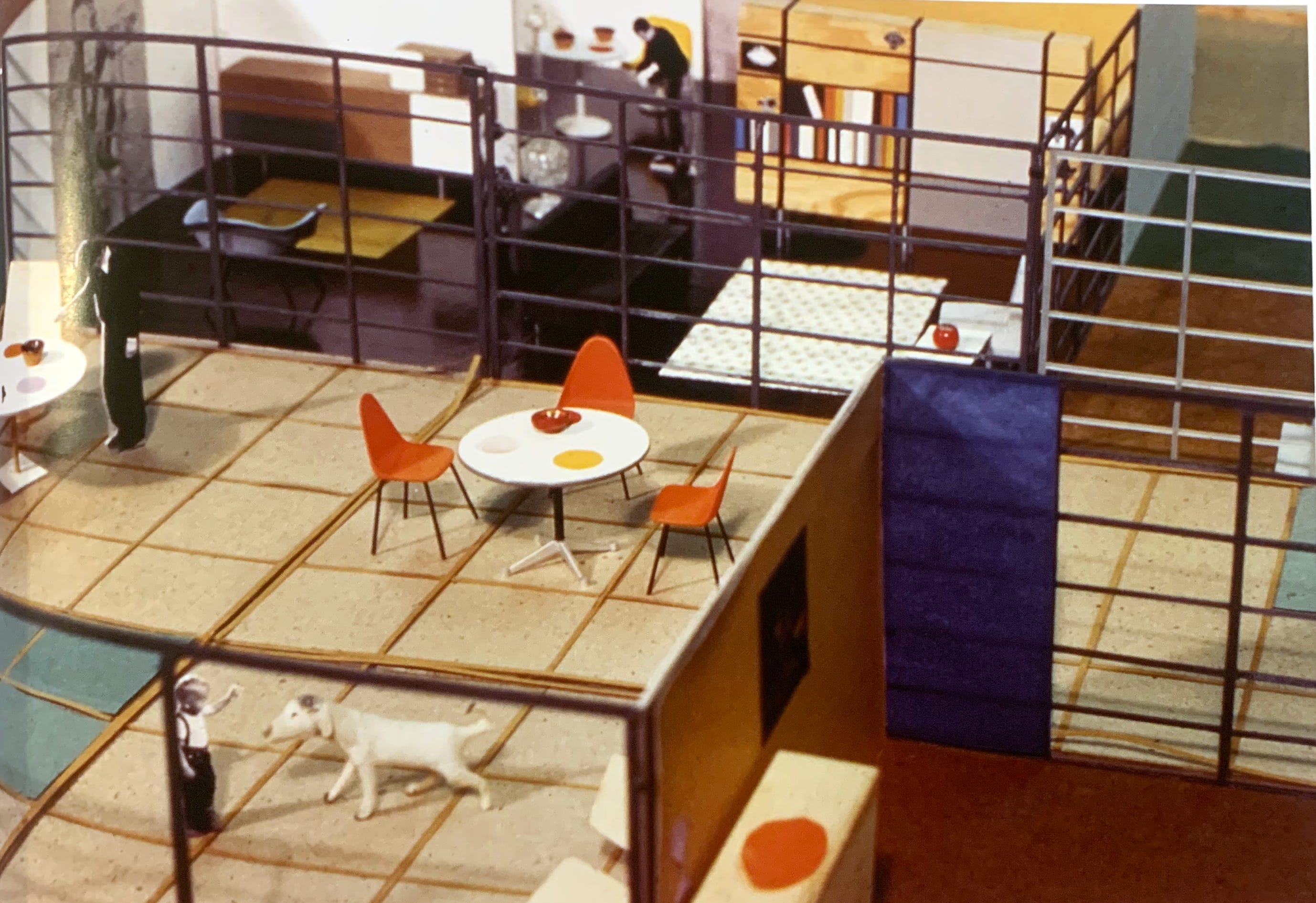
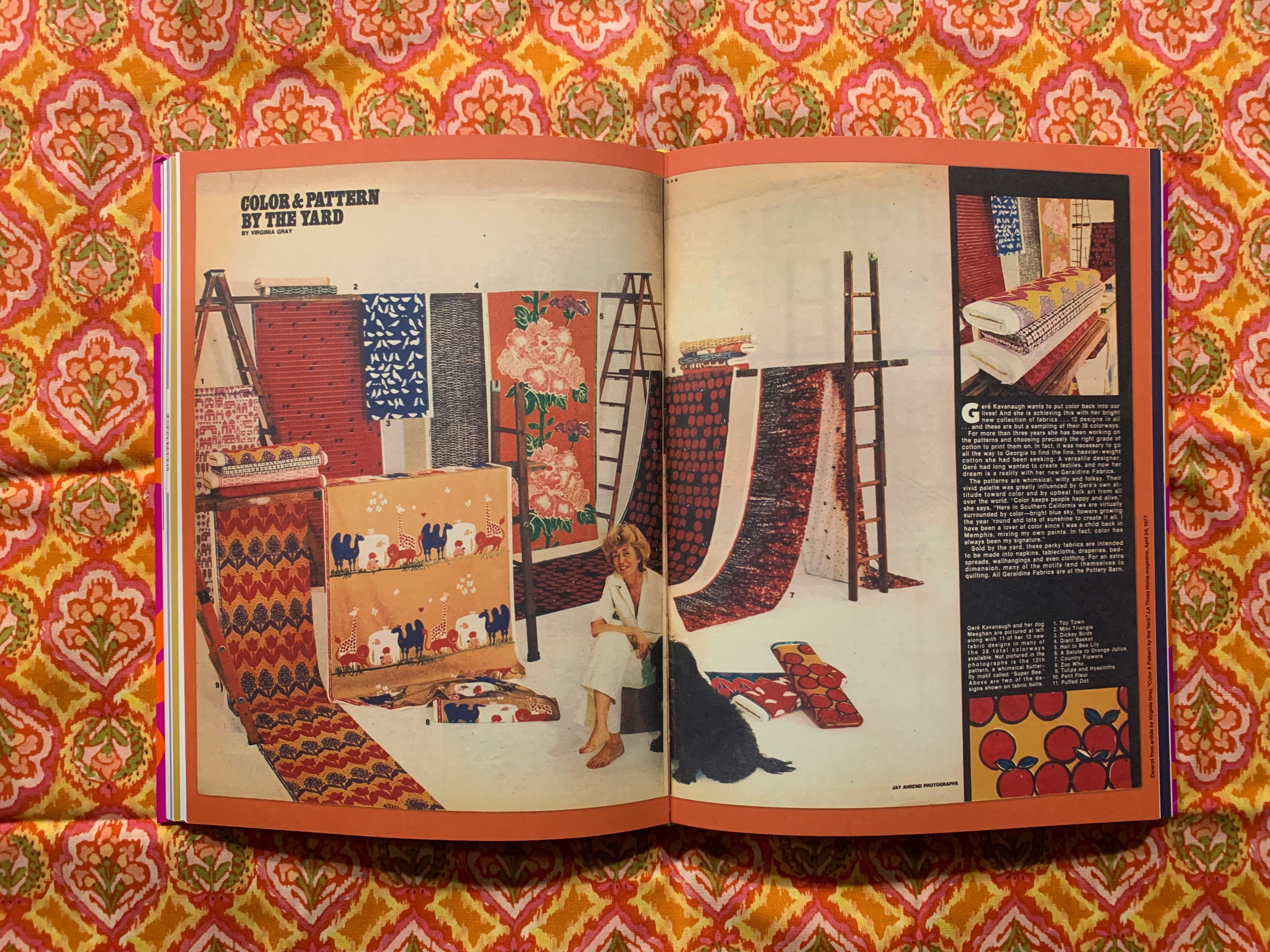
Gere Kavanaugh (first name pronounce “Jerry,” go figure) comes from a later generation than Corita or the Eameses, but her work slides more neatly into my own living memories. I didn’t discover the beauty of most Mid-century design until I was an adult, but colors and patterns like Kavanaugh’s were imprinted on my mind from an early age.

Per the monograph A Colorful Life, Kavanaugh started out as an interior designer, with a focus on retail shopping centers, aka malls. I grew up in malls! The vestiges of this type of work were still with us at that time - the Westfarms Mall in central Connecticut, where I spent endless hours as a child and teen, had some of the earmarks of this earlier school of design, whereas later area malls seemed much more sterile and utilitarian.

But as anyone who’s looked in my closet knows, I’m in it for the textiles! Her pattern designs leap off from the playful austerity of work like the Eameses’, with a major infusion of the type of handcrafted psychedelia that came into vogue via pop-culture caricatures of the hippies.
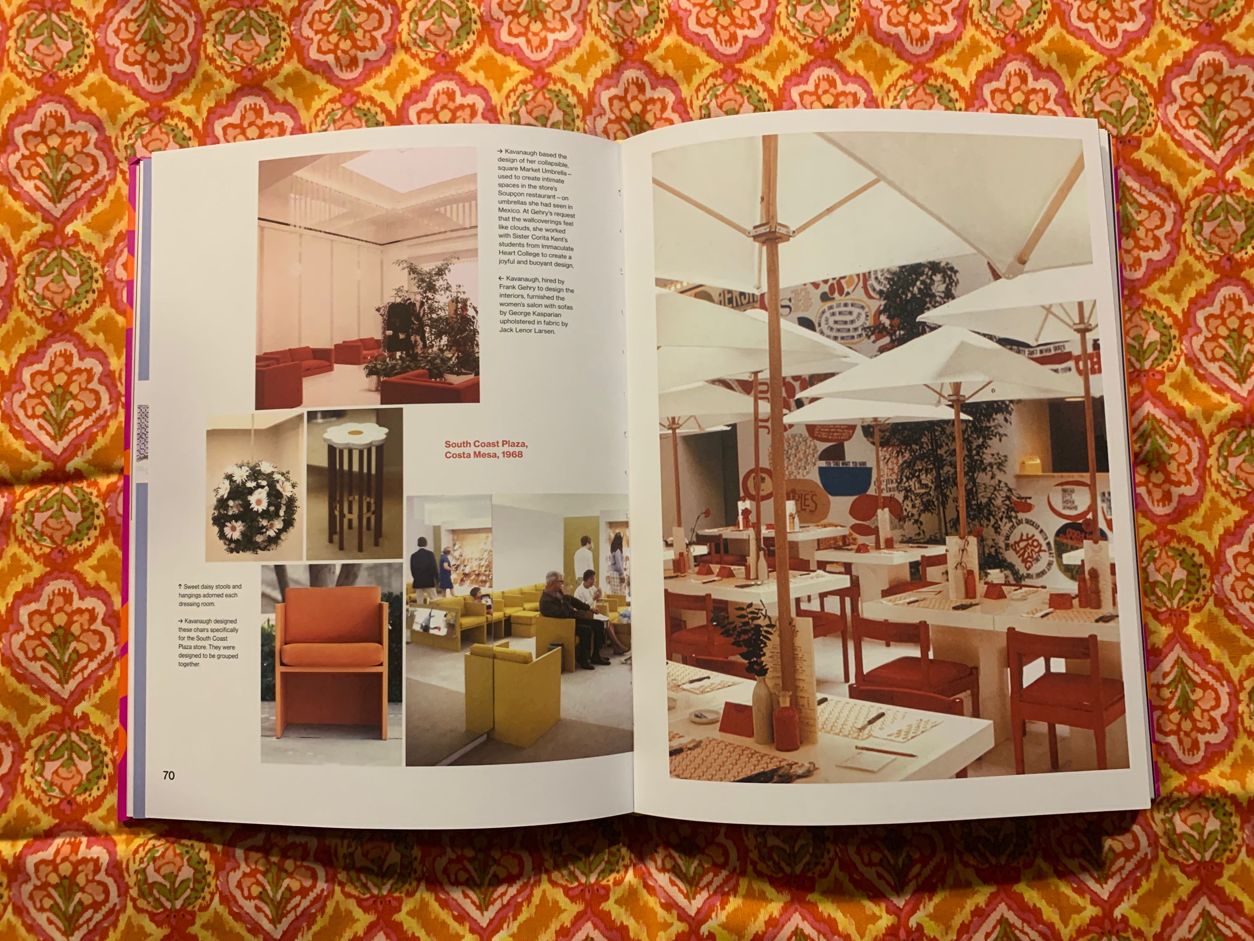
Kavanaugh struck off on her own in 1964 after stints with General Motors and Victor Gruen Associates, one of America’s biggest retail developers. As her own boss (in a space she shared with an up-and-coming architect named Frank Gehry), she joined the Eames tradition of solving any problem that came her way, regardless of discipline.

I feel like the style of the ‘80s and ‘90s reflected an extreme backlash to ‘70s maximalism, and it’s a damn shame. I’ll never fully know the extent to which my embrace of my adult style originated as sheer contrarianism versus a genuine love for eye-popping designs, but it got so mixed up over the years that it doesn’t matter.
It seems as if back then, things didn’t need to be cool - they just needed to be fun. Form was part of the function - it was more accepted to dazzle and be dazzled. Our whole visual culture has been streamlined by Apple and its ilk, and we’ve been beaten into valuing sleekness above all. But can’t simplicity also be playful?

We’ve also specialized ourselves to death. Renaissance people like Kavanaugh are hard to come by nowadays, since heavily regimented organizations assign creative work piecemeal via proscriptive little boxes at the expense of a cohesive multidisciplinary vision - and then use the failure of that approach as justification for further fragmentation. Maybe that’s not fair - I have no idea what the hell I’m talking about from my little burrow down here. Though I may live in a hole in darkest Brooklyn, I know what lights me up, and often that happens to be the colorful work that comes to me from across a continent and a span of decades.
But maybe it’s not as remote as all that. Kavanaugh is still alive and working, in her mid-90s. If that’s not energizing, then nothing is.